


The "Averaging Illusion"
When the mean change isn't what it seems

One goal of Beyond the Abstract is to explore nuances hidden beneath summarized conclusions. Last week, we compared bad science to magic tricks; let's continue with that metaphor today.
In every good magic trick, the audience sees something that isn’t really there — or doesn’t see something that is. A rabbit vanishes. A card appears. The truth is misdirection. In science, a similar illusion can occur through statistics. Enter The Averaging Illusion.
The Q-collar, a controversial device I've extensively debunked in my research, provides a perfect illustration. Before we dive in, it’s critical to note that this statistical sleight-of-hand is just one of many problems plaguing Q-collar research. Future posts will unpack deeper concerns, but today we uncover a subtle yet important deception hidden in plain sight.
A Quick Q-collar Primer
For those unfamiliar, the Q-collar is worn around the neck and purportedly "protects the brain." Initially marketed as preventing concussions (also called mild traumatic brain injuries or mTBIs), its stakeholders later shifted claims to general “brain protection,” using MRI data to support these claims. [There’s some magic behind that change in clinical purpose, known as “outcome switching”, but we’ll save a discussion of that for another day.]
The Q-collar’s proposed mechanism: compressing jugular veins, trapping extra blood within the brain. This extra blood supposedly creates a tighter fit, limiting brain movement after impacts common in contact sports.
There are numerous reasons to doubt these claims (to be covered separately, and published elsewhere). Today, we'll explore how statistical manipulation has been employed to create a seemingly convincing case about preserving brain white matter.
The Study in Question
One of the first clinical trials examining the Q-collar was published in 2016 (funded by its manufacturer, Q30 Innovations). This study enrolled 62 high school football players — 32 wore the collar, 30 did not. Players wore the device throughout the season, undergoing brain MRIs before and after.
Researchers used Diffusion Tensor Imaging (DTI) — a sophisticated MRI technique — to study the integrity of brain white matter. Without diving deep into technicalities, let’s say DTI is incredibly complex. The brain is segmented into various regions (like the corpus callosum), each analyzed to measure specific properties of brain tissue.
Researchers interpreted any DTI changes during the season as evidence of subconcussive brain damage. Conversely, they hypothesized the collar’s effectiveness would be indicated by a lack of change in DTI metrics among collar wearers. In other words, stability in DTI values was considered to be a sign that the brain’s white matter remained intact.
Where the Magic Happens
At first glance, results look promising: the collar group showed “no change,” while controls showed measurable differences — suggesting the collar offered protection. A quick read of the abstract is convincing. But let’s look closer.
Why am I skeptical? Many reasons, but here's one simple yet profound issue: group averages do not reflect individual-level changes. Put simply: "individual results may vary."
To their credit, the authors provide individual-level data for one specific DTI measure — axial diffusivity (AD). The figure from their paper appears below:
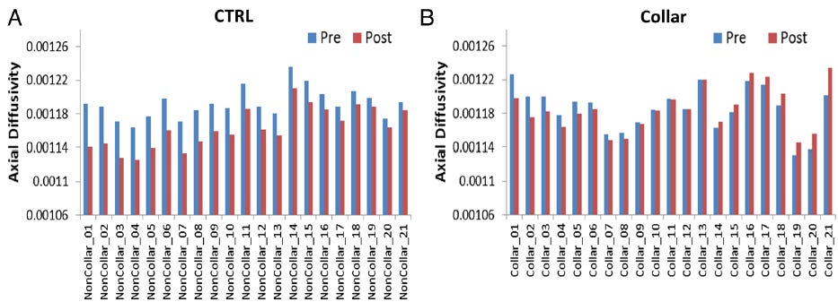
When one examines the data, something interesting is revealed in the Q-collar group (figure on the right):
11 athletes experienced a DECREASE in their AD (labelled on the x-axis as Collar_01 through Collar_12)
8 athleted showed an INCREASE in their AD (Collar_14 through Collar_21)
Only two individuals (Collar_12 and Collar_13) who wore the collar actually experienced no change.
So, the variability wasn’t hidden—but their interpretation didn’t reflect that variability. According to their own logic — that stability in DTI values implies brain protection—only 2 of 21 players were truly “protected.” The other 19 had white matter changes that, by the study’s own interpretation standards, should raise concern. Instead, they emphasized the group-level result of “no significant change” and used that as evidence of brain protection.
If stability in DTI values is considered evidence of brain protection, then any deviation — whether an increase or decrease — suggests disruption rather than preservation. The question then becomes: does an increase in AD indicate one type of potential injury, while a decrease signals another? Without clear biological rationale for these opposing changes, it’s impossible to claim the collar is providing meaningful protection.
This “Averaging Illusion” masks meaningful individual variations, both increases and decreases, creating a misleading impression of the collar’s effectiveness. That’s where the magic comes in—not from hiding the data entirely, but from drawing conclusions that gloss over what the data actually show.
[NOTE: Clinical interpretation of DTI data is far more complex than this. For instance, does no change in DTI truly indicate brain protection? Does the magnitude of change matter? Do DTI changes predict future brain pathology? I have explored some of these nuances (and what they mean for Q-collar evidence) in JAMA Neurology and we may revisit them here in future posts]
An Analogy: Averaging Pushups
This issue of averaging to obscure meaningful individual variation isn’t unique to the Q-collar study—it’s a statistical illusion that can appear in many forms. To illustrate, let’s consider a simple example: push-ups.
Imagine a study where sedentary individuals each initially complete as many pushups as possible, and all manage to complete exactly 20. After taking a new “supplement,” half dramatically improve to 40 pushups, while the other half become so incapacitated by muscle pain they perform 0. Although every individual's capacity dramatically changed, the average change would misleadingly indicate no effect (average: still 20 pushups).
This is essentially what we see in the Q-collar example — claiming that the Q-collar wearers were “unchanged” when in reality most experienced change, but the directional effects cancelled each other out to create the appearance of stability.
Just like the pushup example, averaging masks critical individual differences. Relying on averages alone can give a profoundly misleading impression of a treatment’s true impact.
The Other Magic Trick (Did You Catch It?)
We’ve been so focused on this statistics trick — but, did you catch the other part of the magic trick?
Remember what we stated in the beginning - there were 62 participants in the study. Yet, above, only 42 are mentioned. What happened to the remaining 20 (representing nearly one-third of the participants)? In fairness, the reasons these participants are missing is described in the study’s methods — they were excluded for various reasons. Here’s the study’s explanation:
“Of the 62 participants enrolled, 1 participant had contraindications for MRI (dental braces); 1 athlete had test anxiety with MR testing; 2 participants did not complete all testing due to medical issues that arose during the season unrelated to football participation; and 2 participants suffered a season-ending injury. Twelve participants had unusable MRI data on either preseason or postseason testing due to motion artefact during the scan and were excluded from all imaging analysis leaving 42 (21 collar and 21 CTRL) study participants (age 17.13±0.66 years; figure 2).”
But, do the math carefully — start with 62 participants and then start subtracting people out. Do you come up with 42 participants, as they report? Or do you get 44?
Let’s break it down:
62 initially enrolled
Minus 1 (dental braces), 61 remaining
Minus 1 (test anxiety), 60 remaining
Minus 2 (medical issues), 58 remaining
Minus 2 (season-neding injury), 56 remaining
Minus 12 (unstable MRI), 44 remaining
To continue our magician metaphor, it seems like they made two participants “disappear” from their per-protocol analysis!
While isolated numerical discrepancies may not always be cause for alarm, errors like these, especially in a body of research with other inconsistencies, warrant a closer look. At what point do these errors stop being incidental and start indicating broader reliability concerns?
This issue about Q-collar data was covered by
in an investigative piece in The Chronicle of Higher Education.The Final Act: Deconstructing the Illusion
Let’s summarize the”Averaging Illusion.”
You start with a group of individuals — some get better, some get worse. But instead of showing the full story, the researcher waves their statistical wand and presents a single, clean number: the group average.
And just like that, all the messy variation disappears.
What the audience sees: “No change.”
What actually happened: Everyone changed, just in opposite directions.
This illusion transforms disorder into order, uncertainty into certainty, and sometimes even failure into apparent success. It’s not exactly a lie—but it’s not the truth, either. It’s the kind of truth you get when you only look at the stage and not behind the curtain.
So next time you hear that a treatment "had no effect on average," ask yourself:
What did the individuals experience?
What did the magician hide up their sleeve?
Because in science, just like in magic, the real story often lies in what you weren’t shown.
Why This Matters
My primary goal isn't just to debunk one questionable product — it's to improve overall science quality and integrity. Important lessons here include:
Group averages can conceal critical individual variability, creating misleading impressions of effectiveness.
Exclusions and dropouts must be scrutinized carefully — these seemingly small details can substantially affect conclusions.
This highlights the importance of looking beyond abstracts, press releases, and flashy summaries to critically evaluate underlying data.
This statistical illusion is just one troubling issue among many concerns surrounding Q-collar research, some of which I've addressed in peer-reviewed literature and plan to unpack further in future posts. But remember: much like a magician relies on misdirection, questionable research can rely on numerical misdirection. Always keep your eyes firmly on the data behind the curtain.
I’m building Beyond the Abstract to push for better science — open, honest, and free of illusion. If that mission resonates with you, consider subscribing. And better yet, share this piece with someone who still believes research should earn its applause through integrity — not carefully crafted illusion.