

Statistically Significant, Practically Useless
Rethinking the meaning of "weak" correlations

We've all heard it countless times: "Correlation does not imply causation." But today, I want to go beyond this common wisdom and tackle a subtler, yet equally important issue: What does it mean when correlations are statistically significant—but extremely weak? Or, put another way, why don’t we ever see any reports of a “significant non-correlation?”
This week, we’ll dive into statistics a bit, with the idea that understanding weak correlations will be important for unpacking a number of other studies we’ll discuss. This isn’t meant to be Stats 101, but rather aims to provide insight into how statistics can sometimes be misinterpreted. In fact, weak correlations are at the heart of a previous post - the link between facial attractiveness and Tour de France performance.
Quick primer: r-values, p-values, and practical importance
Let’s start with some terminology. A correlation explores the relationship between two numerical variables. For instance, “what is the relationship between shoe size and height?” or “do people with higher blood glucose levels also have higher LDL cholesterol?”
When we calculate a correlation, we get two separate values:
Correlation coefficient (r): Ranges from –1 to +1. The square of r (r²) indicates the percentage of variance in one variable explained by the other. We’ll use the terms “correlation coefficient,” “r,” and “r-value” interchangeably.
p-value: Represents the probability of observing our data (or a more extreme pattern) if there truly is no correlation (r=0). A small p-value tells us that our observed correlation is unlikely to be due to random chance alone—but it doesn't tell us how practically important that correlation is.
Example: Suppose we went to a local grocery store and measured everyone’s strength in both legs. We’d expect individuals with strong right legs to also have strong left legs, and those with weak right legs to have weak left legs. Those two values would likely have an r-value close to 1.0.
We can visualize this easily with a scatterplot, plotting one number on the x-axis and the other on the y-axis. A very close relationship will show data points forming a nearly straight line. Here's a fictional dataset visualized:

In my fictional dataset, r=0.983—which is a VERY strong correlation. Knowing the strength of someone’s right leg gives us tremendous insight into their left leg strength.
Squaring this correlation coefficient gives us r². Here, 0.983² = 0.9659. Thus, about 96.59% of the variance in left leg strength is explained by right leg strength. (Remember, correlation is NOT causation: the right leg does NOT cause the left leg to be strong; instead, they’re closely related due to underlying factors.)
Correlations also produce p-values. Typically, if p < 0.05, we call the correlation statistically significant.
When Significant Isn't Meaningful
In research articles, correlations are often categorized as strong, moderate, and weak. Generally:
Strong correlations (r > 0.70): Clear, visually apparent relationships.
Moderate correlations (r ≈ 0.40–0.70): Noticeable trends, though somewhat noisy.
Weak correlations (r ≈ 0.10–0.30): These present minimal visual trends, easily overlooked.
Let’s use and adapt a great visualization by Rensink to to illustrate these categories clearly:

Statistically significant but weak correlations—like r = 0.15, p = 0.03—frequently appear in research papers, press releases, and news headlines as "significant findings." But have you ever actually seen what an r-value around 0.30 looks like visually?

It looks like a shotgun blast. The data points are scattered widely, forming only a vague trend. Mathematically, the correlation differs from zero. If you squint, you might notice a slight upward trend, but practically, it’s very subtle.
Statistically, with a p-value <0.05, we've cleared the threshold to reject the null hypothesis of no correlation. Practically—does it truly matter?
I'd argue not really. Calling these correlations "weak but significant" might even be misleading. A more accurate interpretation could be:
"Statistically significant—but practically negligible."
These correlations don’t meaningfully predict outcomes, improve treatments, or inform good decisions. Knowing a value on the x-axis gives very little insight into the corresponding y-axis value—a stark contrast to our leg-strength example. These correlations are often statistical phantoms, artifacts of large samples or precise measurement rather than meaningful signals.
Devil's Advocate: Could Weak Still Mean Something?
Some might argue that even weak correlations shouldn't be quickly dismissed. For instance, a correlation of r = 0.21 is still larger than something trivial like r = 0.03. Couldn’t weak correlations indicate subtle underlying factors worth investigating? Perhaps weak correlations reflect complex relationships involving multiple small factors, or perhaps they only matter within certain subgroups or under specific conditions. Furthermore, in complex systems, seemingly small effects can interact with other variables, potentially contributing to broader, more significant patterns.
This is valid—but weak correlations alone shouldn't drive firm conclusions without further context or stronger evidence. They're better seen as clues suggesting areas for deeper investigation. Thus, weak correlations may serve as valuable starting points for further research, but on their own, they do not constitute definitive evidence of meaningful relationships.
Semantics Matter
When we label correlations as "weak," we implicitly suggest they're still useful—just modestly so. “It’s weak, but still correlated,” our minds reason.
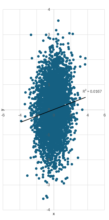
For example, here’s a weak (r = 0.13) yet statistically significant (p < 0.001) correlation with a trendline. It’s basically random data with no practical structure, yet it’s officially labeled a “weak correlation” rather than a “non-correlation.”

Just for fun, notice how compressing the x-axis visually exaggerates the apparent trend (below). [This is the same exact data and scatterplot as above, but we are just making the figure more narrow to make the trend look more dramatic]
Weak correlations are rarely useful alone. Perhaps we need better terminology:
"Statistically significant trivial correlation"
"Practically negligible relationship"
Or even (tongue-in-cheek): "Significantly not correlated"
The goal isn't to reject statistics, but to align statistical language with practical reality. "Statistically significant" does not necessarily mean meaningful, actionable, or impactful.
Conclusion: Beyond the Numbers
Ultimately, it's critical that we recognize statistical significance as a starting point—not an endpoint. Weak correlations, even when statistically significant, rarely offer practical guidance on their own. Rather than allowing these faint signals to dominate headlines and influence decisions, we should interpret them with caution, skepticism, and context.
In future posts, we'll continue unpacking examples of weak correlations and examine how they can be misinterpreted as meaningful. But next week, we’ll shift gears slightly to share some practical insights and tips for navigating academic careers—stay tuned!
In the meantime, I'd love to hear from you: Have you encountered weak correlations that were treated as important findings? Drop a comment and share your examples or thoughts below!